 CONTACTCONTACT
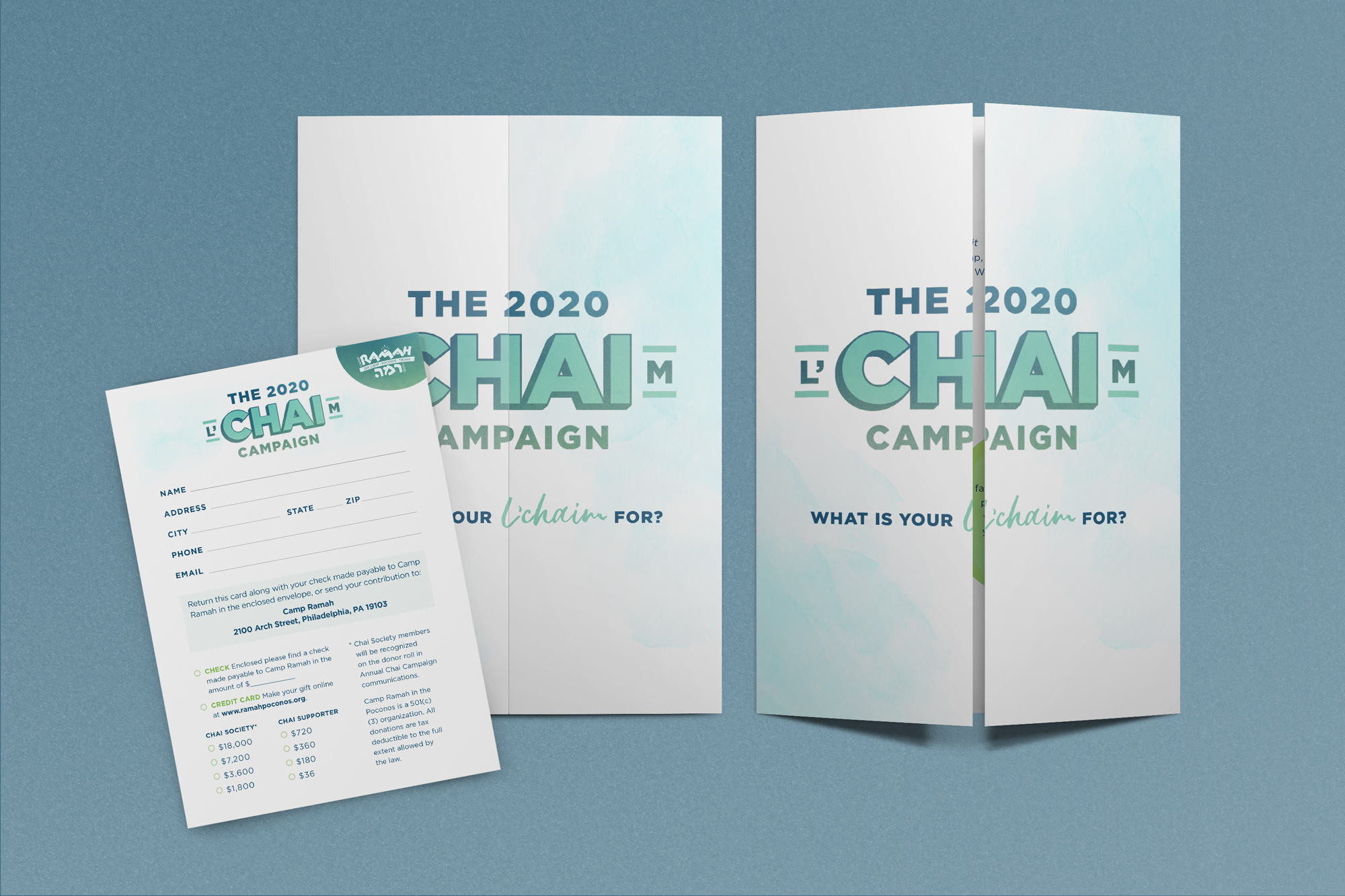
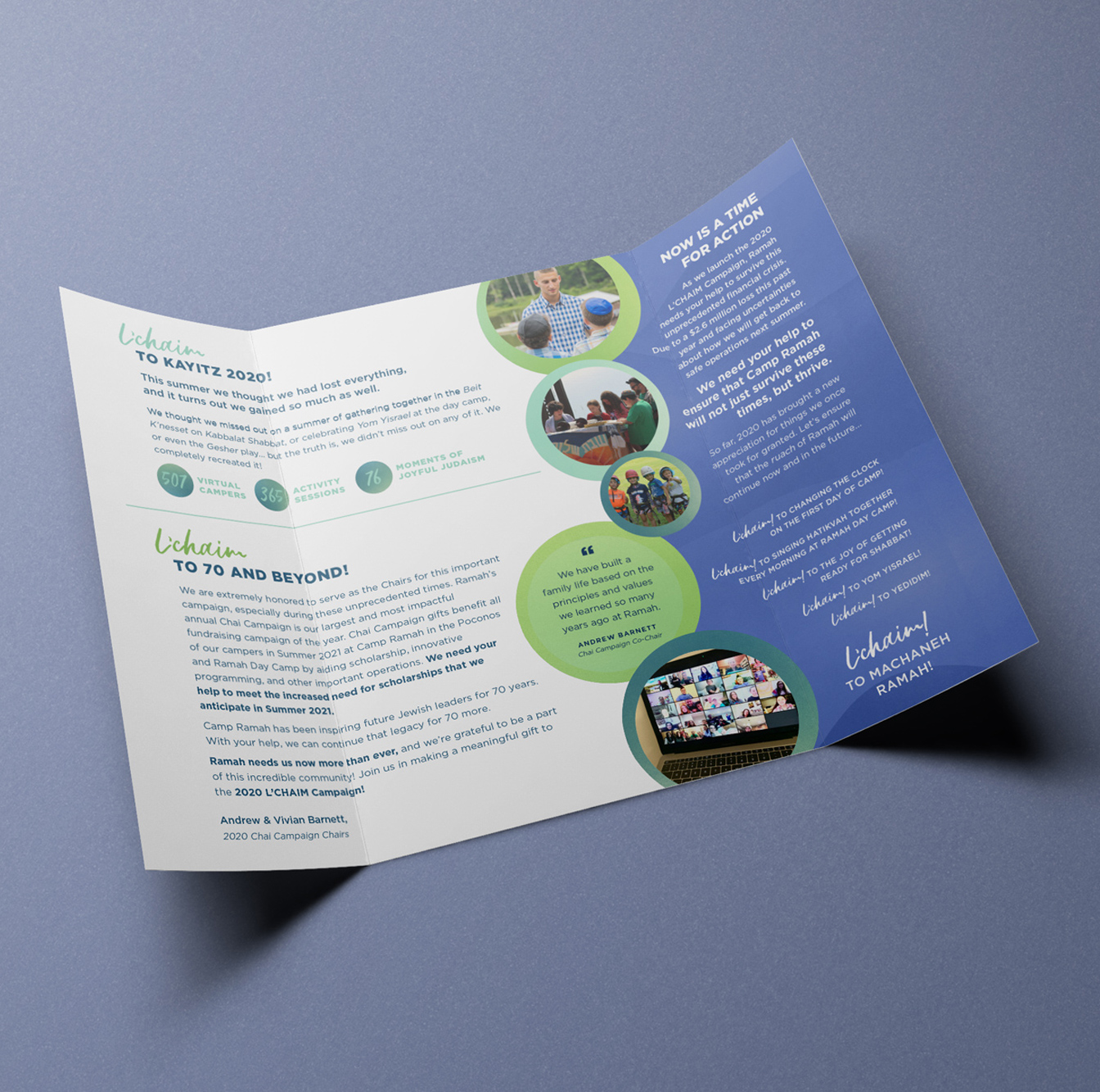
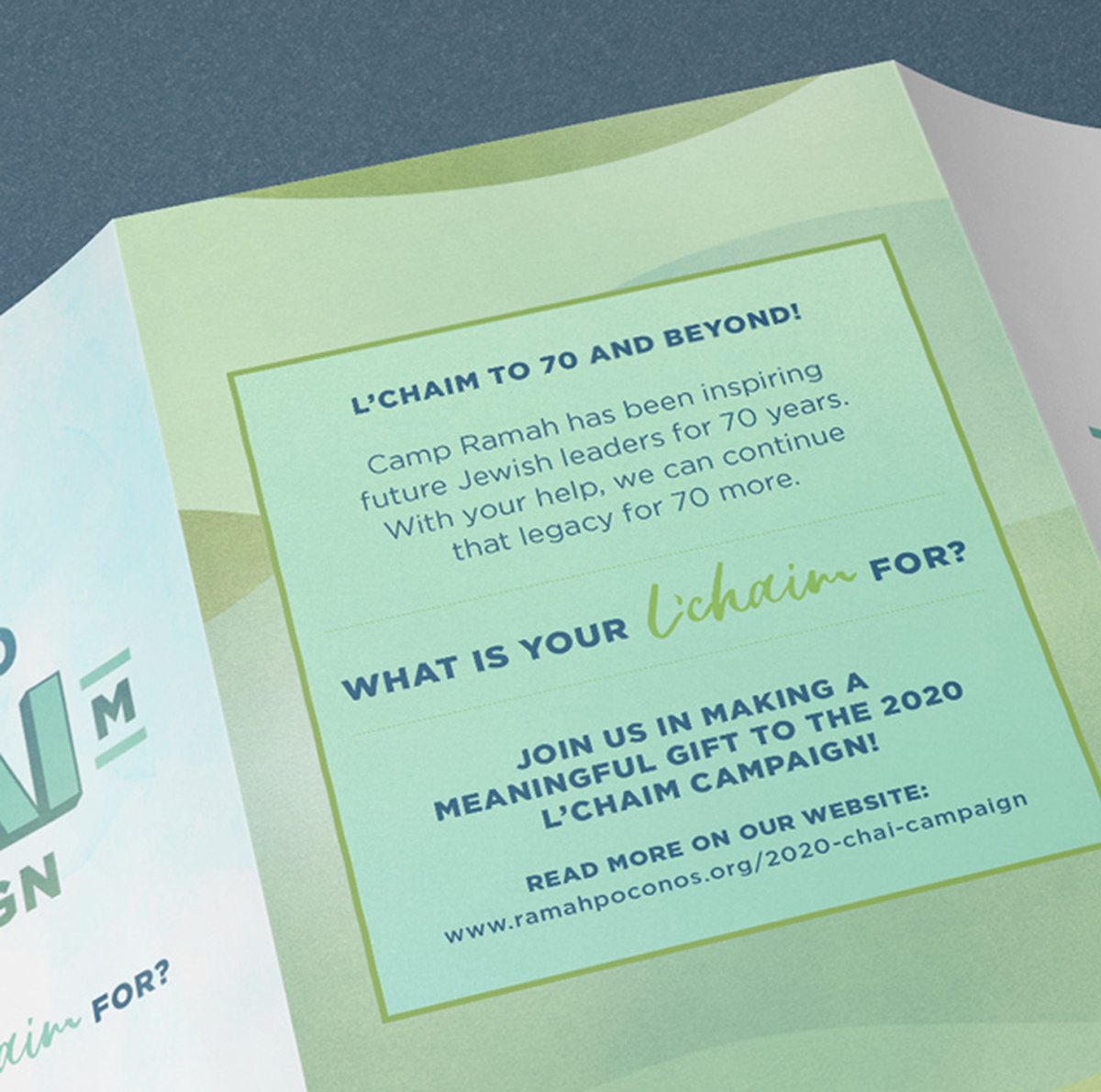
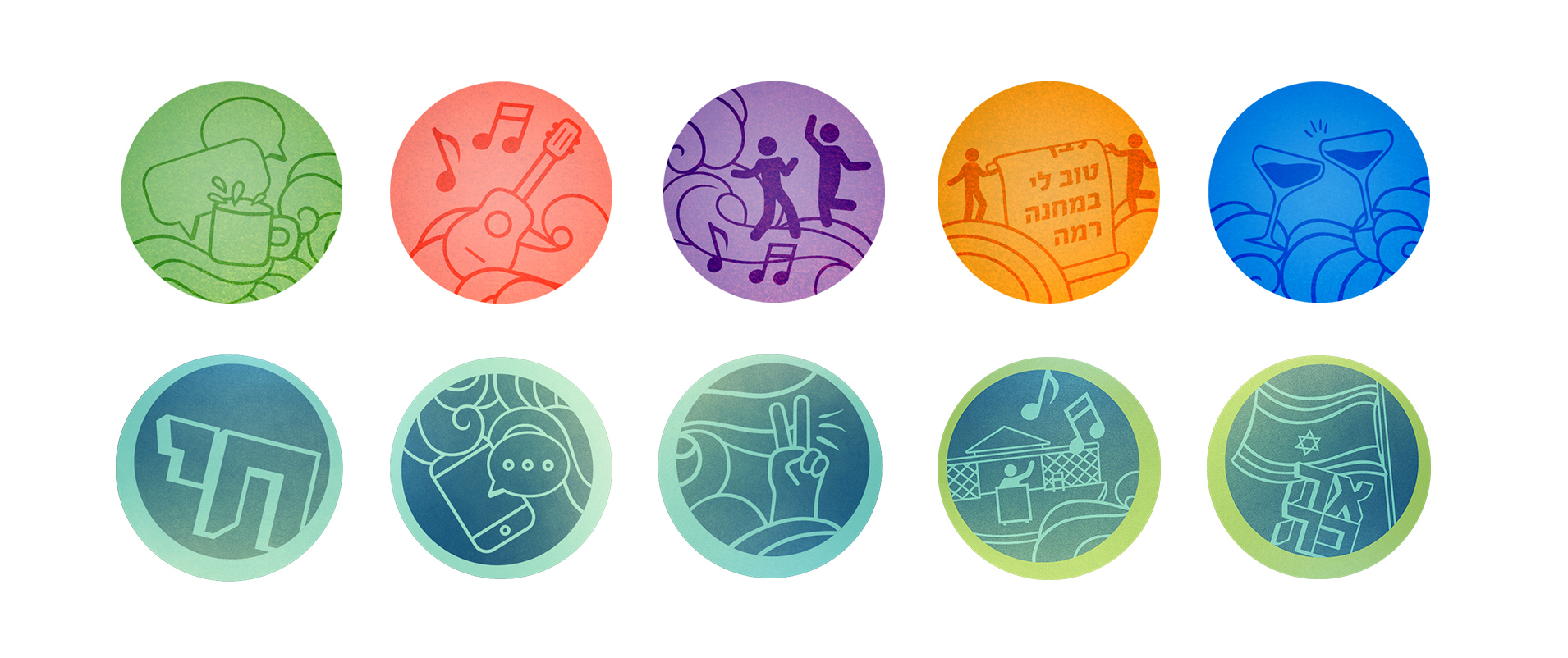
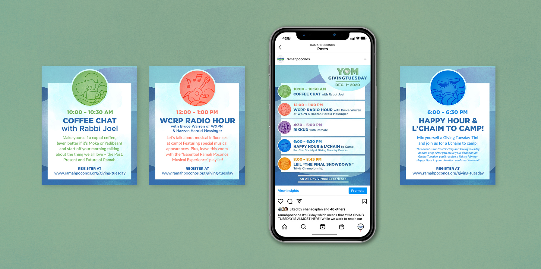
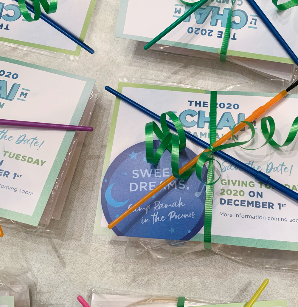
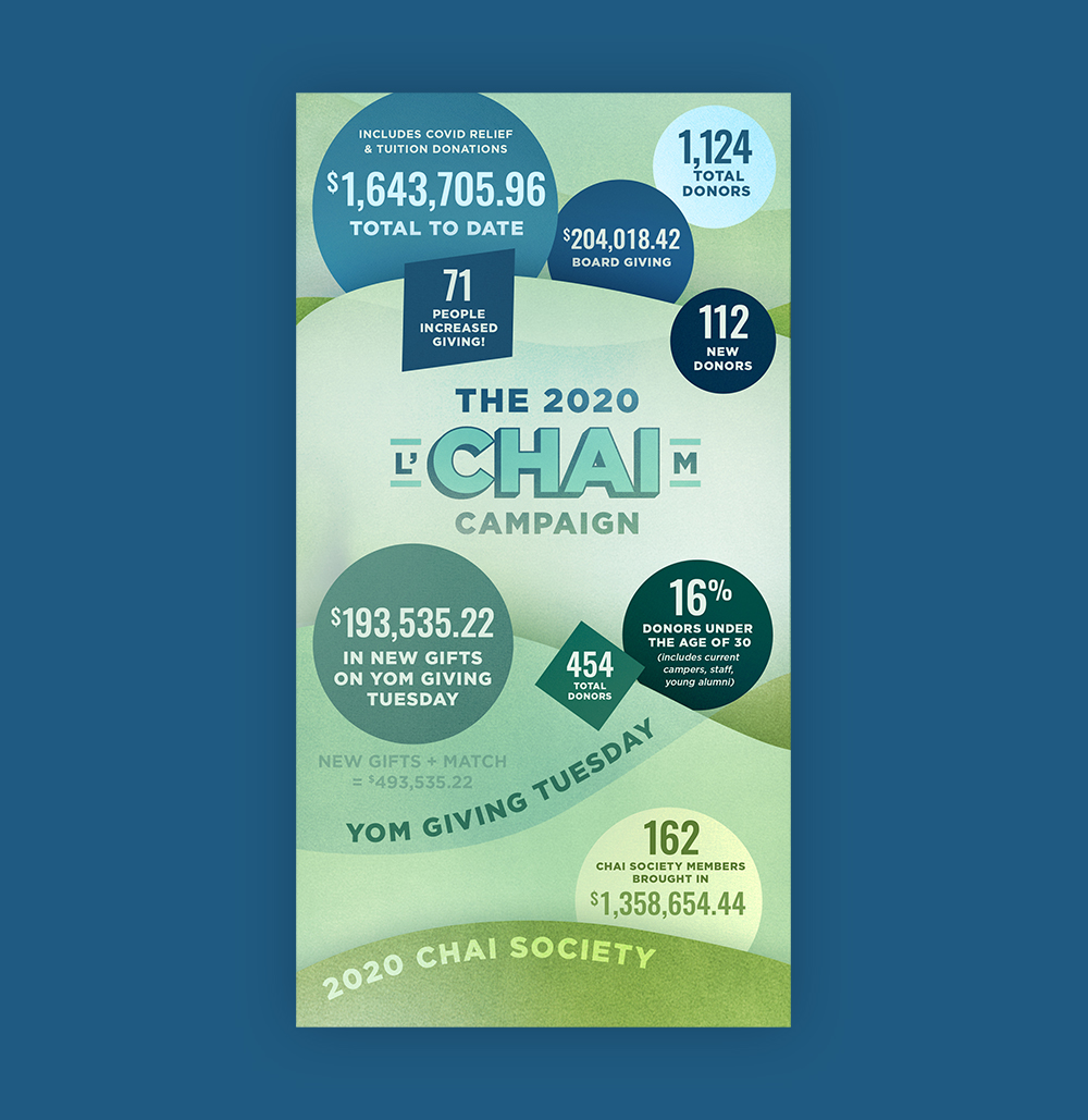
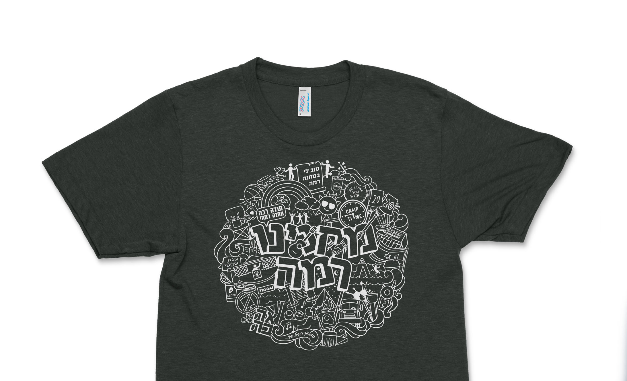
To aide in the financial setback due to a cancelled camp season, we strategized an identity, copy, and collateral to support a monumental fundraising goal. The colors are a variation on the non-profit's iconic blue & green, toned down from the bright colors of summer to reflex the gravity of COVID-19's impact. Hand-drawn assets give a feeling of community, the corner stones of the fundraising strategy.